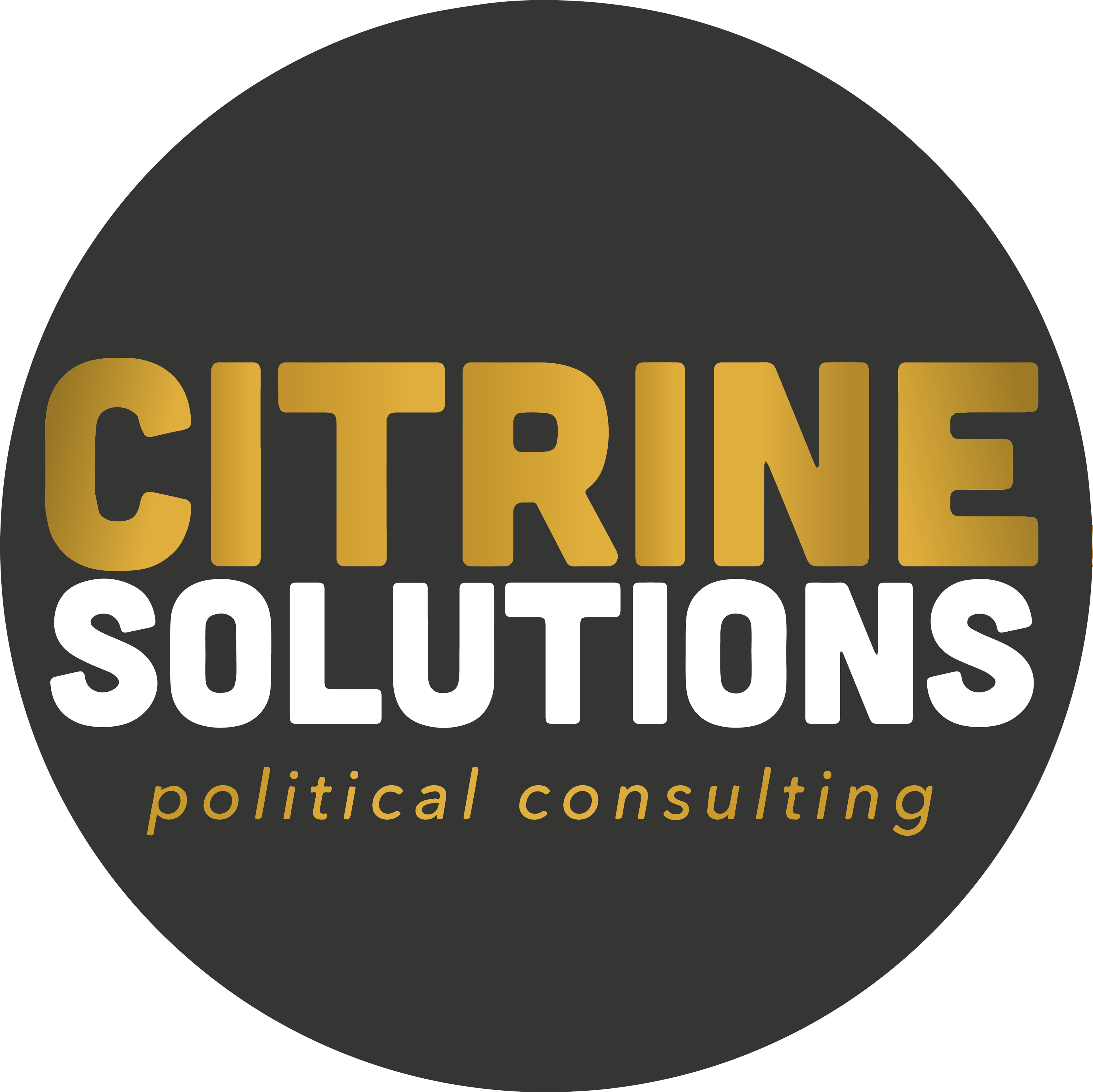
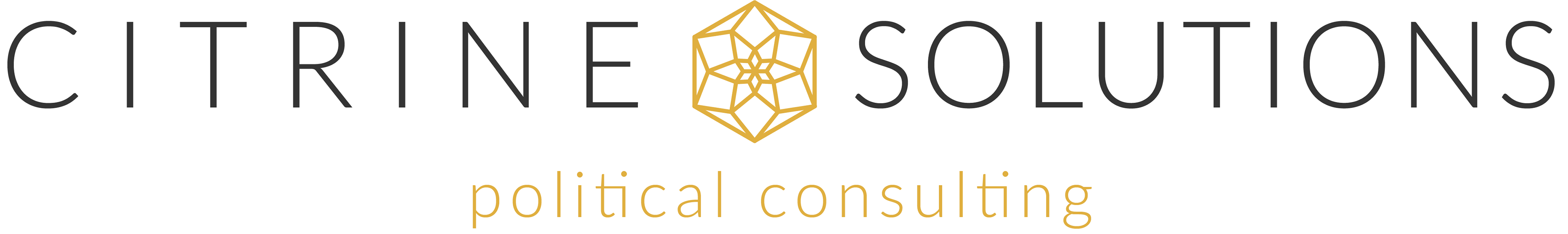
CITRINE SOLUTIONS LOGO
The goal of this logo is to portray a strong, community-minded political consulting firm whose target clientele are younger, Democratic-leaning politicians. They wanted a bold logo that portrayed strength and didn’t shy away from the feminine. The bold, contemporary sans-serif typeface was chosen due to its softer edges and strong, stable letterforms. Their advocacy work and political platforms focus on community and mutual aid, this led to the logo being contained within the center of the circle to symbolize being part of the solution for the betterment of the whole community and not just the individual. The requested companion logo is used for certain advocacy situations with older, more conservative clients.